

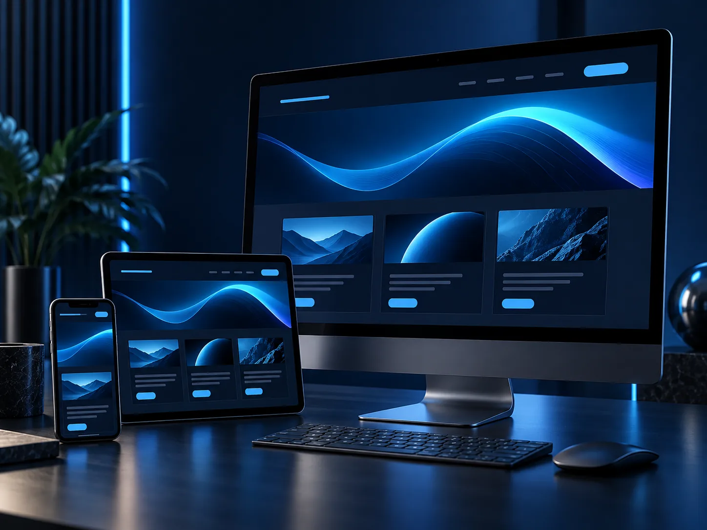
After more than a decade online, it was time for the DT-Software website to better reflect the work we do today and make it easier for visitors to find the right service.
Why we made the change
Technology has moved on considerably since our previous website was launched. Screen sizes, accessibility expectations and the way people research potential technology partners have all changed. Our own range of services has continued to develop too.
The old website contained valuable information, but its structure and presentation no longer gave visitors the clearest view of what DT-Software can provide. The redesign gives that information more room, improves the journey between related services and creates a stronger foundation for future updates.
“The goal was not simply to make the website look newer. It was to make it clearer, more useful and more representative of DT-Software.”
What’s new?
The new design introduces a cleaner layout, stronger typography and a refreshed blue visual style inspired by the DT-Software identity. Content is easier to scan, calls to action are clearer and important information no longer competes for attention.
Clear navigation
Services are grouped logically so visitors can reach relevant information more quickly.
Focused content
Each page explains the problem a service solves, what it can include and how we work.
Consistent experience
A shared design system creates a familiar journey across the complete website.
A clearer view of our services
Every organisation approaches technology from a different starting point. Some need a completely new application; others need existing systems to exchange data, an older website to do more, or a database to become easier to manage.
The redesigned website gives these areas their own focused pages, including:
- custom software built around a particular process;
- system integration that removes repeated data entry;
- database development, migration and optimisation;
- web and mobile development;
- WordPress, Joomla and bespoke website functionality;
- e-commerce solutions and payment integration; and
- content management websites that teams can update confidently.
This should make it easier to understand where we can help—even when the final technical solution is not yet clear.
Built for every device
The new website adapts across desktop computers, tablets and mobile phones. Text remains readable, navigation stays manageable and important actions remain easy to use without pinching or zooming.
Accessibility and performance have also influenced the new structure. Semantic page content, visible keyboard focus, useful alternative text, responsive images and reduced-motion support help make the experience more inclusive and dependable.
What comes next
A website should never be treated as finished forever. We will continue adding useful explanations, project insights and news that answer the questions clients commonly ask before beginning a software or website project.
Most importantly, the new website gives us a stronger platform for showing what bespoke technology can achieve when it is designed around a real business need.
If you are considering a new system, an integration, a website improvement or a mobile application, tell us what you would like to make easier. An early conversation is often the best place to begin.